Typography? 1960's?

Hey there! Welcome to my blog! On this blog it will focus on the typography trends during the 1960's.

So what is typography?

Typography is the style and appearance of printed matter or the art or procedure of arranging type or processing data and printing from it.

Ever since the time typography was invented, various trends have emerged from each era. Each having their own unique characteristics that represents the movements and fads during that time. Typography is an essential part of everyday life ranging from a casual conversation online to an important document. We often do not notice the importance of typography, since it’s goal is to be invisible.


The following blog posts will start off with a brief history and then discuss various trends and influences and how they were used in this era.

A Brief History

The 1960s was a hectic time in history involving many protests and movements that formed modern society. It was the time where people were standing up to unfair social norms and fight for equality amongst the nation (as well as going a bit wild). Afros was a thing and bellbottoms were popular. Also, lava lamps were invented in this time period. Key events included the civil rights movement, the assassination of Martin Luther King Jr. and ending off the decade with sending Neil Armstrong, the first man to step foot on the moon. Movements that emerged during this era includes pop art and psychedelic. The iconic movements that were mentioned, influenced many fonts that people associate the 60’s with. 


Images: https://s-media-cache-ak0.pinimg.com/564x/45/82/08/458208338814f7104808f7d6e32d50c8.jpg
http://67.media.tumblr.com/4d59194f7dfdc7935311358d303faf93/tumblr_nmc6badPQ01rh9ffao1_1280.jpg


The Pop Art Trend

Pop art is an art movement that began in the 1950s but it was popularized in the 1960s by well known New York artists, such as Andy Warhol, one of the most well known artist of this movement. Most of us have probably seen his popular Campbell’s Soup Cans piece floating around on the internet. Pop art was created to challenge traditional art by showcasing popular culture and everyday items. “Pop art has become one of the most recognizable styles of modern art.” (“The Art Story,” n.d.)

Pop art is still a very popular art style up to this very day. It influenced typography with its fun, bright and eye catching colours that draws your attention. Typefaces inspired from pop art had comic like designs that gives off a “fun” feeling, and was mainly used as a title font for posters and album covers.

Fonts influenced by pop art:


As shown, these fonts share similar characteristics with each other as they are all:
  • Sans-Serif
  • Mainly rounded
  • Fun and casual

The Psychedelic Trend


During the 60’s there was a point in time where society was becoming more rebellious and adventurous with drugs and expressing their sexuality, leading to the usage of drugs such as LSD. Soon it became popular, thus creating the psychedelic movement. Psychedelic refers to the hallucinations users experience from the drug and these hallucinations looked like abstract swirls of colours. Many artworks were inspired by the swirling colours from the hallucinations during this era. It also heavily influenced fashion, language and literature. Wes Wilson is one of the best-known designer of this movement, mainly known for his posters for Bill Graham of The Fillmore.
            
With its abstract characteristic and popularity with the youth, psychedelic influenced the shape and colours of typography. It inspired typefaces to visibly showcase a trippy feeling by incorporating movement in the text. However, psychedelic typefaces have lost popularity and are rarely used now.


Fonts influenced by psychedelic:


https://images.download-free-fonts.com/2016-10/sfhallucination-ttf.png
https://d35fkdjhhgt99.cloudfront.net/static/renders/34/30412/800/1/54930d8b/victor-moscoso.png

The similarities each font have with each other are:
  • Sans-serif
  • Wavy design
  • Involves movement to create the trippy effect

The Futuristic/ Modern Trend

Futurism was an Italian movement started in 1909 that embraced new media and technology. Although the movement have ended in 1920, the fonts created during that time have become timeless and are still used to this day. You can see them all over ads and packages in the 60’s. Since they easily legible, it would make sense to use these fonts for large bodies of texts instead of the more graphic fonts inspired by pop art and psychedelic.

Popular futuristic fonts include:

Similarities:
  • Sans-Serif
  • Geometric
  • Modern 

How were They Used?

Now that we have gone through some of the typography trends in the 60’s, let’s look at how and where they used and applied each trend.

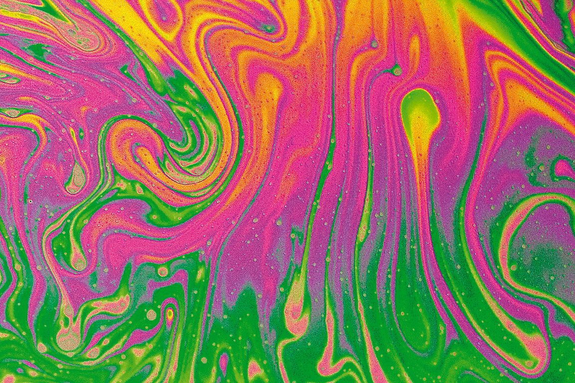
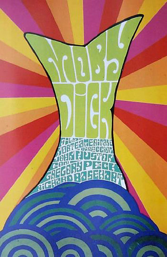
When looking at posters, you want to catch the person’s attention. Psychedelic and pop art is commonly seen across the multiple posters.


Images:https://blogger.googleusercontent.com/img/b/R29vZ2xl/AVvXsEhY6kKAO25IuD7pf3wlcVicnFCq5V6LGx3fcMvo-97Bdfv6uWsmfshTIP3Sm7oJQCNlgZfccdMczDCTxyXSSe6KcVxv8p5StgreLrtRhCUTDXIU0qfB1tF9vPMI1ECL6NI9QokMWxlH_wmg/s1600/04+April+29-30+1966+Artist+Wes+Wilson.+Jefferson+Airplane,+Quicksilver+Messenger+Service,+Lightning+Hopkins+at+Fillmore+Auditorium,+SF.jpg
http://farm5.staticflickr.com/4032/4252322739_bf683c1a82.jpg
https://blogger.googleusercontent.com/img/b/R29vZ2xl/AVvXsEhboV1bomp8Sj7hVJP4L9z2eKmkyI8jEUohiKefaRTbozfKvBI3t-W7QYqWsl-JImXDgSsWkVgRf_jbpSBYg1imCzFYJyAEtIb43ZSV4QPIhAX4tzx6ZLH3Qkpo2U2gtxvC3WPivNWxYow/s320/D-027.jpg


The bright, vibrant colours represent both pop art and psychedelic. Whereas the "moving" font represents the psychedelic trend.


Images: http://file.vintageadbrowser.com/l5j7vhxdd9bx03.jpg
http://file.vintageadbrowser.com/l-h68nlcl3gq5dfw.jpg
http://file.vintageadbrowser.com/s9zt4c7h4vzxgs.jpg

Ads in the 60's had large bodies of text and barely included any decorative fonts. Ads are kept simple and clean with solely using modern fonts.

Poster vs. Ad

At a first glance, it is obvious there is a vast difference in terms of design between posters and ads during the 60s. The poster is more concentrated on the graphics and can be concluded it is focused on targeting teens. Whereas the ads are more simple and informative, leading to an assumption it is targeting adults instead.