Now that we have gone
through some of the typography trends in the 60’s, let’s look at how and where
they used and applied each trend.
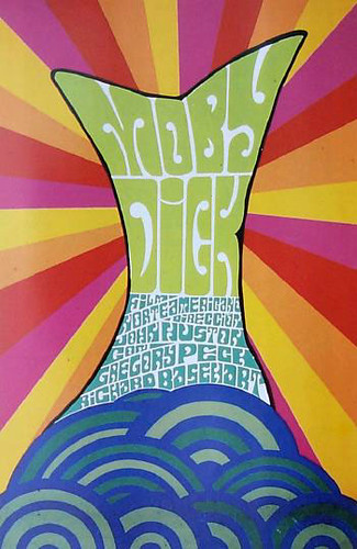
When looking at posters, you want to catch the person’s attention. Psychedelic and pop art is commonly seen across the multiple posters.
Images:https://blogger.googleusercontent.com/img/b/R29vZ2xl/AVvXsEhY6kKAO25IuD7pf3wlcVicnFCq5V6LGx3fcMvo-97Bdfv6uWsmfshTIP3Sm7oJQCNlgZfccdMczDCTxyXSSe6KcVxv8p5StgreLrtRhCUTDXIU0qfB1tF9vPMI1ECL6NI9QokMWxlH_wmg/s1600/04+April+29-30+1966+Artist+Wes+Wilson.+Jefferson+Airplane,+Quicksilver+Messenger+Service,+Lightning+Hopkins+at+Fillmore+Auditorium,+SF.jpg
http://farm5.staticflickr.com/4032/4252322739_bf683c1a82.jpg
https://blogger.googleusercontent.com/img/b/R29vZ2xl/AVvXsEhboV1bomp8Sj7hVJP4L9z2eKmkyI8jEUohiKefaRTbozfKvBI3t-W7QYqWsl-JImXDgSsWkVgRf_jbpSBYg1imCzFYJyAEtIb43ZSV4QPIhAX4tzx6ZLH3Qkpo2U2gtxvC3WPivNWxYow/s320/D-027.jpg
The bright, vibrant colours represent both pop art and psychedelic. Whereas the "moving" font represents the psychedelic trend.
Images: http://file.vintageadbrowser.com/l5j7vhxdd9bx03.jpg
http://file.vintageadbrowser.com/l-h68nlcl3gq5dfw.jpg
http://file.vintageadbrowser.com/s9zt4c7h4vzxgs.jpg
Ads in the 60's had large bodies of text and barely included any decorative fonts. Ads are kept simple and clean with solely using modern fonts.
Poster vs. Ad
At a first glance, it is obvious there is a vast difference in terms of design between posters and ads during the 60s. The poster is more concentrated on the graphics and can be concluded it is focused on targeting teens. Whereas the ads are more simple and informative, leading to an assumption it is targeting adults instead.


No comments:
Post a Comment